

Yosemite is full of little updates. If you spend enough time using it, you're almost guaranteed to find a new feature almost every day. Some improvements are big, and some are small, but even the small ones can have a positive impact on your computing experience.
One of the smaller improvements made in Yosemite is the ability to transform your menu and dock from a light experience to a dark. Why would you do this? If you spend enough time working in professional-grade apps (like Final Cut Pro X and PhotoShop), you'll notice that they have a darker feel to the app than consumer-grade apps (like iPhoto and iTunes). This same "dark" experience can now be brought to the OS X level, if that's your preference.
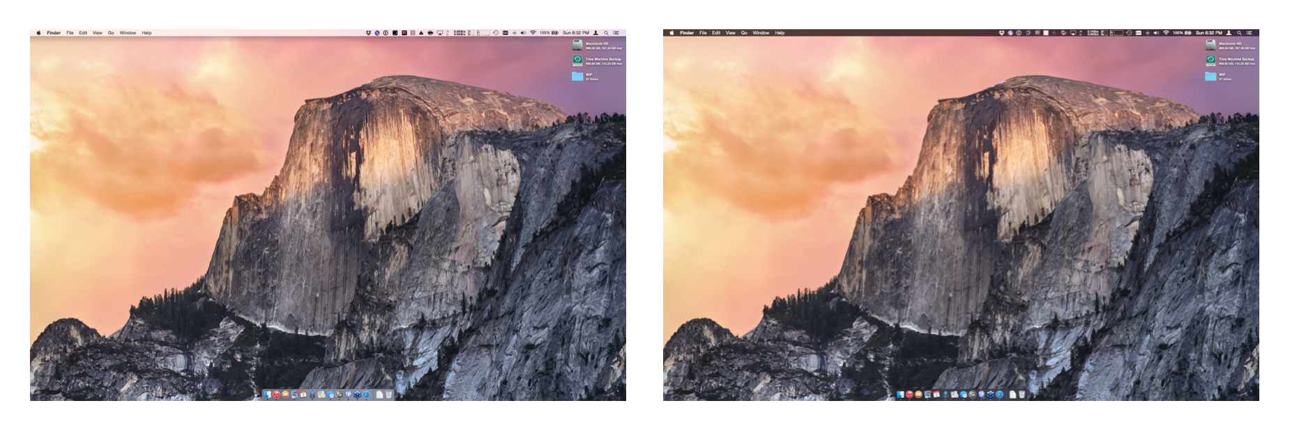
The image below gives you an idea of what this change looks like. On the left side is the default "light" feel applied to Yosemite while the right has the "dark" feel applied:
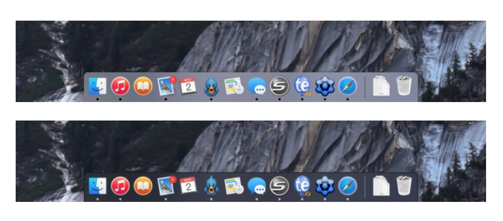
Here's a closer look at what this looks like on your dock:
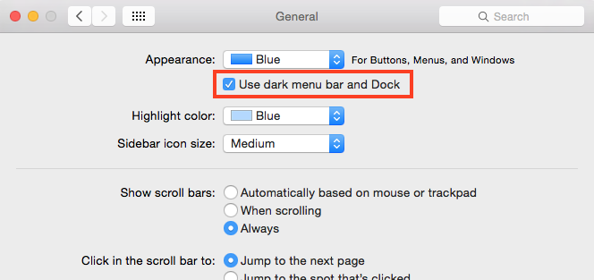
Convinced you want to make the change or just want to try it out? Making the change is simple. Open System Preferences and click on the General button. Near the top of the window, check the box labelled "Use dark menu bar and Dock". That's it!
If you're not convinced that this look is for you, you can obviously switch back and forth as much as you want.


